Some things are so bad that you don’t even want to mention them. It would just drive attention to something that doesn’t deserve any attention. Kind of like that song “It’s Friday,” which became grossly popular simply for being so bad. The website that I’m going to write about today is that bad. It’s so bad that I’m not even going to link to it. I don’t want Google to think I’m giving it any kind of positive recognition. I’m not.
However, I’m writing about this website, because, like many bad things, it provides a good learning experience in web design. Also, it’s J.K. Rowling’s website, so it’s probably getting a lot of traffic anyway. You would think that someone whose material (the Harry Potter books, if you’re having a hard time recalling who Rowling is) has been marketed so well for over a decade would have a more intuitive web design.
She doesn’t.
In fact, Rowling’s web designers apparently thought they were being so mind-blowingly innovative that they included instructions on how to use the website. I’ll walk through the different aspects of the website so you can see what I’m talking about.
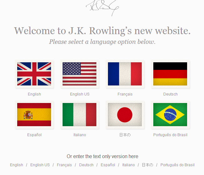
When you first go to J.K. Rowling’s website, you land on this page:
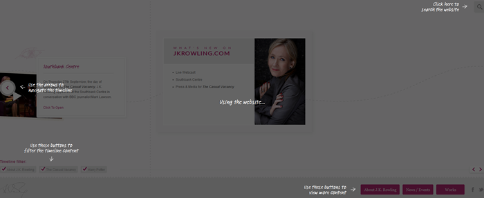
There’s nothing wrong with this page. Many websites direct you to select a language. However, the best – or in this case, the worst – is yet to come. Once you select your language, you get taken to this lovely page:
Now, maybe we’re just behind the ball when it comes to website design. Perhaps the trend these days is to make sites so confusing that you have to explain to visitors how to use the website. I’m not buying that. I think the advice that Steve Krug wrote in Don’t Make Me Think back in 2005 still applies in many ways today. However, the people in charge of Rowling’s website either don’t care about making a website’s navigation intuitive for the users or they realize that the last thing Rowling needs to worry about is making conversions that will lead to revenue flow, so they just throw all good advice out the window. Look at the details they go into to explain how to use the sight:
![]()
Okay…that’s why the website grayed out on me. I have to read the instructional manual first.

Thank goodness there’s a search function. I’m going to search “Why is this website so confusing?”

Should I be insulted that you don’t think I know how to click on an arrow to navigate?

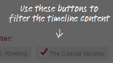
I might have been able to pick that up from the Timeline Filter text that appears above the buttons, but who knows?

Ahhh…the main navigation is buried at the bottom of the page. That makes perfect sense!
Overall, I would label this website a disaster. As a user, I fluctuated between frustrated at the site’s design (such as the navigation only being on the bottom) to be slightly insulted (do you really have to explain to me that I should click on an arrow?). An effective website shouldn’t confuse, frustrate, or insult users; it should tell them what to do. Technically, the Rowling website does just that, but clear calls to action should guide users through the website – not instructions. True, Rowling doesn’t need to worry about her website raking in more money for her. It’s probably not affecting her too negatively. But for most people and most websites, such a design would be a kiss of death.


