Recently, we’ve dedicated a couple of blog posts criticizing poor website designs. To show that we don’t always focus on the negative, we’ve decided to recognize some websites that feature great calls to action, pointing out elements that are perfect for you to copy for your own website.
MailChimp
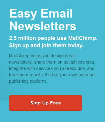
Simple and to-the-point. MailChimp quickly lets the user know what they get: Easy Email Newsletters. The Sign Up is Free. The red button pops against the blue background, without being obnoxious, but still drawing the users’ attention. For a call to action, it’s perfection captured in simplicity.
Wufoo
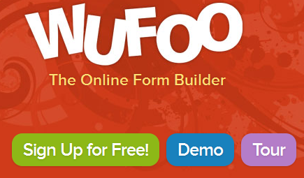
Wufoo uses bright, fun colors to catch users’ attention. The green, blue and purple buttons stand out against the red background, and go well with the site’s overall color theme. Though technically offering 3 different calls to action for users, they still keep it simple. The main call to action (Sign Up for Free!) occupies the most visual space, therefore encouraging users to click on it over the other two options. The phrase under their name quickly tells the user what they’re signing up for: The Online Form Builder.
Eventbrite
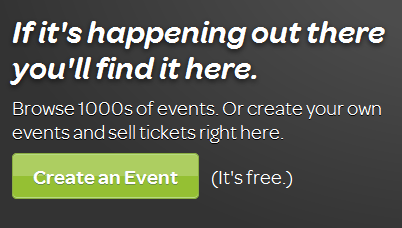
Once again, we see a bold color that helps the button stand out from the rest of the website. The messaging is simple and easy-to-understand at a glance. With this setup, this site is serious about getting conversions.
Esurance
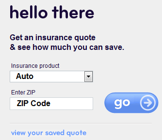
With this call to action, it’s as simple as 1, 2, 3. Choose your insurance, enter your zip code and click go. They also offer to let users “view your saved quote,” but this option is no distraction to the big, blue Go button. While Esurance has changed up their site’s appearance over the years, they always keep their call to action simple, and therefore, simply awesome.
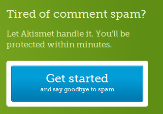
Akismet
One last call to action, and one more great example. The blue pops against the green, while the message is straightforward and compelling. It doesn’t get much better, and, yes, I actually want to sign up for their service.
With all these examples, you’ll notice some common themes:
- Bold Colors – grab the users’ attention
- Simple Content – quick summaries explain the service in a sentence or less
- Few Distractions – they’re not offering 6 or 10 different actions from which users must choose.
Keeping the above ideas in mind, take some time to evaluate your own website’s call to action. Maybe you’re inundating users with too many choices, and not guiding them to one or two specific actions. Maybe your Sign Up button is a bland color that simply blends in with the rest of the website. In just a few minutes, you can probably think of ways to incorporate the above ideas into your site’s call to action and therefore improve your conversions.
Are there specific calls to action that you think are great? Do you have more questions about how to change your site’s call to action? Let us know in the comments below.


