Getting links on great local sites is key to achieving good positioning in the search engines, i.e., getting more traffic to your website. But where do you start? Below, I’ve broken out some simple ways that you can approach building links for you company.

1. Use Social Media: Maintaining an active presence on Twitter, Facebook, and LinkedIn can help you network and find individuals who might be willing to link to your site.

2. Join Associations and Organizations: If you’re a member of the Better Business Bureau or the Chamber of Commerce, these organizations will typically link back to your site. Such links will help establish your website as a local authority in the search engines. However, don’t just stop with your local Chamber of Commerce or BBB. Are there other local groups you are affiliated with? Credentialed by? If so, see if they are linking to your website, or ask them if they will.

3. Search for Local Blogs and Websites: You might be fortunate enough to be located in an area with a great repertoire of local sites and blogs that you can tap into. If such is the case, comment on these blogs (including links, if possible), offer to write a guest post for them, or request that they link to a valuable “local resource.” To find these types of sites, you can search:

Your City + “Blog” or “News”
Your Zip Code + “Blog” or “News”

4. Submit to Local Directories: Finding local directories can be pretty easy. Use search queries such as:

Your City + “Directory”
Your Zip Code + “Directory”
Your Neighborhood + “Directory”

You can even do a statewide query to help expand your local directory search.

Remember – this list is not exhaustive. Instead, it’s designed to complement your current SEO strategies. Above all, remember to keep producing content. Valuable content will help build your credibility – both online and locally, Over time, great content will not only grab the attention of the search engines, but it will also help establish you as an expert in your field – an attractive quality for potential customers.

Read More


At Digital Dogs, we’re getting ready to launch a new website design for our own company. We’re extremely excited about the new look we’ll be pushing live in a few weeks. As we’ve gone through the process of the redesign, it’s forced us to reevaluate our company’s online presence. If you’re considering a website, there are some things you should keep in mind, particularly in regards to maintaining your SEO. Following the below six steps will help you maintain your website’s rankings and traffic even during a time of transition.

Step 1: Establish Goals

  • Determine Key Performance Indicators (KPIs) to Use for Before and After Comparisons
  • Capture Data on Your Site’s Pre-Design Performance
  • Be Consistent with Comparisons
    • Adjust for Seasonal Spikes
    • Re-Launch during a Month when Traffic Has Stayed Relatively Flat in the Past

Step 2: Re-Evaluate Keyword Strategy

  • Assess Current Keywords against Your Business Objectives
    • Which Keywords Currently Drive Traffic to Your Website?
    • Which Keywords Convert Traffic into Business?
  • Determine which New Keywords You Should Implement
    • What Keywords Do Your Competitors Show Up for that You Don’t?
    • Have You Expanded Your Services but Not Your Keywords to Include Those Services?

Step 3: Conduct Page Optimization

  • Use Your Keywords to Optimize Individual Web Pages
  • Make Sure Pages Are Built with the Right Structure for SEO
    • Single <h1> Tags
    • Good Use of <h2> Tags
    • Compelling Meta Descriptions
    • Good Body Text
    • Unique Title Tags
  • Follow a Consistent Approach & Messaging with Your Pages

Step 4: Design Infrastructure for SEO

  • Keep the URL Structure as Flat as Possible
  • Use Descriptive File Names
  • Use 301 Redirects for Old URLs to New URLs (if you change the URLs for the new sign)
  • Align Title Tags, Meta Descriptions, Headlines, etc., with Your New Keyword Focus
  • Include Sitemaps
    • Visible Sitemap
    • XML Sitemap
    • Video XML Sitemap (helpful in highlighting video on your site)

Step 5: Audit Links

  • Review Your Current Backlinks
  • Determine if Your Links Reflect Your New Keyword Focus
  • Adjust Your Link Building Efforts Accordingly

Step 6: Monitor Customer Sentiment

  • Set Up a Social Media Campaign for the Site Launch
  • Tweet about the Launch
  • Monitor Customer Sentiment & Reactions
  • Make Adjustments to Content that Confuses Users

By following these steps, you can avoid a drastic fall in rankings and traffic as you transition to your new website.

Have you gone through a redesign recently? What are some tips you found to be helpful during the process? Let us know in the comment section.

Read More


The other day, I came across the below infograph, which compares SEO to a healthy diet and PPC to plastic surgery.

I find this an interesting idea for explaining these online marketing methods. I’m sure it helps set client expectations and is useful in differentiating the services to clients, who often expect instantaneous results from SEO, despite all the information out there that SEO is anything BUT instant.

However, I think this infograph also draws attention to potential pitfalls when it comes to managing online marketing, particularly when it comes to PPC. For example, we’ve all seen example of plastic surgery gone bad.

The same thing can happen to your PPC campaigns, if you put them in the hands of an inexperienced or careless doctor…er, PPC specialist. If you choose someone simply based on price, you can actually end of spending lots of money but will never receive good results (though someone charging exorbitant prices does not mean s/he provides quality services). Likewise, you don’t want to put your SEO under the control of someone who practices extreme dieting (i.e., black hat tactics), because the end results will be anything but healthy for your company’s online presence and your bottom line. Keeping your website safe from these shysters involves doing your research before hiring someone. If you’re wondering how you find a good person, there’s a great video about that here.

In the end, while this infograph does a good job of indicating the TIMEFRAME on which SEO and PPC work, as well as gesturing towards INHERENT DANGERS with each one, it privileges the SEO over PPC. Most people naturally assume that dieting is the healthier (though more difficult) means of achieving sustainable results, when compared to plastic surgery. However, this analogy does not apply to PPC and SEO. A company’s investment into PPC or SEO depends on its unique situation. Oftentimes, a mix of both PPC and SEO creates the ideal online presence for a company. PPC can often be very effective for short-term offers or for branding purposes. However, neither approach is inherently better than the other, and a good online marketer will be able to present the best combination and options for your company, its current situation, and its future goals.

If you have any questions about implementing SEO and PPC for your company, feel free to contact Digital Dogs. You can also leave your questions or feedback in our comment section.

Read More


Last Friday, we did a Friday Fail on web design. This week, we’re doing a Friday Fun post. If you have a WordPress website, having an SEO plugin is necessary to optimize your website. But which one is the best? Well, here’s the answer, straight from the Most Interesting Man in the World:

What WordPress plugins (SEO or any other) do you prefer? Let us know in the comments.

Have a happy Friday and a great weekend!

Read More


At Digital Dogs, part of our SEO services include implementing comprehensive link building campaigns for our clients. Sometimes these services turn out to be out of someone’s price range or the client is simply very eager to contribute to our link building efforts and wants to know the best way to pitch in and help. In either case, we typically send an email with some instructions on how the website owner can advance the SEO efforts of her/his website. However, the other day I ran across this great instructograph put together by Portent. It provides a nice breakdown of how to content websites for potential link building. Seeing as how the original poster of this instructograph encouraged people to share it, I thought I would post it on our blog to share with our clients. Enjoy.

How to Write an Effective Outreach Email

Read More


We have many clients that come to us without a mobile website, which is a 100% necessity in today’s online world. Over 20% of all online traffic comes from mobile devices, so if your website is not mobile-friendly, you could turning away a good number of potential clients who search from their mobile devices. However, making your site mobile requires more than just the flip of a switch. There a are a few different mobile site architectures from which you must choose. Sometimes, this task can seem daunting, but today we’re going to break down the pros and cons of each option, and hopefully help make your decision a little easier.

Overall, there are basically three mobile site architectures from which you can choose:

Click image to enlarge. Source:http://www.slideshare.net/aleydasolis

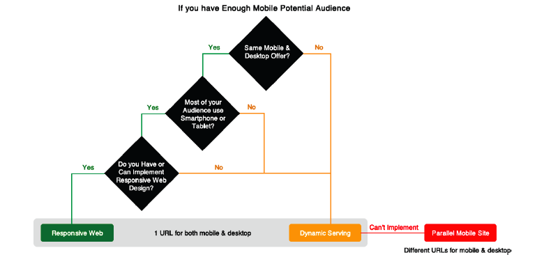
These days, most people have probably heard of the responsive design option, but it’s not the best solution for every website or every company. To decide among the different options, consider the below decision tree:

Click image to enlarge. Source:http://www.slideshare.net/aleydasolis

Going through this decision tree should give you a good idea of which mobile site architecture might be best for your company’s needs. Regardless, of which option you should decide to move forward with, it’s always a good idea to review all the choices before making a final decision. With that in mind, below is a breakdown of the pros and cons for each option.

Responsive Design

Pros

  • 1 URL for both versions, no duplications
  • Easier and cheaper to maintain
  • Popularity consolidation
  • No need for URL redirects

Cons

  • Possible redesign needed
  • Less differentiation of Mobile Content
  • Lower mobile-focused user experience

Dynamic Serving

Pros

  • 1 URL for both versions, no duplications
  • Popularity consolidation
  • Capacity to differentiate mobile content
  • Better mobile user experience

Cons

  • Complexity of technical implementation
  • Higher cost of maintenance

Parallel Mobile Site

Pros

  • Easier Implementation
  • Capacity to differentiate mobile content
  • Better mobile user experience

Cons

  • Content duplication risk
  • Split link popularity
  • Higher cost of maintenance

While the technical implementation of each option poses no problem for us, you should consider that options, such as Dynamic Serving, which require more technical implementation will typically be more costly to implement, as a result.

If you need to make your site mobile, we encourage you to contact us. We can discuss all of the different options with you and help you make the best decision for your company.

Read More


Recently, we’ve dedicated a couple of blog posts criticizing poor website designs. To show that we don’t always focus on the negative, we’ve decided to recognize some websites that feature great calls to action, pointing out elements that are perfect for you to copy for your own website.

MailChimp

Simple and to-the-point. MailChimp quickly lets the user know what they get: Easy Email Newsletters. The Sign Up is Free. The red button pops against the blue background, without being obnoxious, but still drawing the users’ attention. For a call to action, it’s perfection captured in simplicity.

Wufoo

Wufoo uses bright, fun colors to catch users’ attention. The green, blue and purple buttons stand out against the red background, and go well with the site’s overall color theme. Though technically offering 3 different calls to action for users, they still keep it simple. The main call to action (Sign Up for Free!) occupies the most visual space, therefore encouraging users to click on it over the other two options. The phrase under their name quickly tells the user what they’re signing up for: The Online Form Builder.

Eventbrite

Once again, we see a bold color that helps the button stand out from the rest of the website. The messaging is simple and easy-to-understand at a glance. With this setup, this site is serious about getting conversions.

Esurance

With this call to action, it’s as simple as 1, 2, 3. Choose your insurance, enter your zip code and click go. They also offer to let users “view your saved quote,” but this option is no distraction to the big, blue Go button. While Esurance has changed up their site’s appearance over the years, they always keep their call to action simple, and therefore, simply awesome.

Akismet

One last call to action, and one more great example. The blue pops against the green, while the message is straightforward and compelling. It doesn’t get much better, and, yes, I actually want to sign up for their service.

With all these examples, you’ll notice some common themes:

  • Bold Colors – grab the users’ attention
  • Simple Content – quick summaries explain the service in a sentence or less
  • Few Distractions – they’re not offering 6 or 10 different actions from which users must choose.

Keeping the above ideas in mind, take some time to evaluate your own website’s call to action. Maybe you’re inundating users with too many choices, and not guiding them to one or two specific actions. Maybe your Sign Up button is a bland color that simply blends in with the rest of the website. In just a few minutes, you can probably think of ways to incorporate the above ideas into your site’s call to action and therefore improve your conversions.

Are there specific calls to action that you think are great? Do you have more questions about how to change your site’s call to action? Let us know in the comments below.

Read More


The Oscars are just 2 weeks away, and one movie receiving a lot of buzz is production of Les Misérables. Not one to resist the beauty of great musicals, I’ve decided to write a blog post that incorporates some of the lyrics from the songs in Les Misérables. Today, these lyrics will walk us through the often frustrating process of content creation for our company’s social media presence. That’s right – I said our, as in Digital Dog’s struggle with keeping our social media campaigns up-to-date. While we regularly help other companies maintain a robust online presence, we often fail to put the same techniques into practice for our own company. Despite this fact, we’re finding ways to get better, and hopefully, our experiences will help you make improvements in your own company’s approach. Our story follows.

I dreamed a dream in time gone by

As a company, we believe that our online marketing strategy and social media presence should reflect more than just one person’s or one team’s efforts. For example, at Digital Dogs, we’re broken into basically four different departments: the development team, the designers, the project managers, and the online marketing team. To have our online content – blog posts, Facebook posts, Twitter updates, etc. – created by members of these different teams would best represent the diversity and robust resources we have here at Digital Dogs.

As a company, we hold onto this vision. Everyone agrees to this idea, and we’ve even created lovely schedules to remind everyone when to contribute, with the idea that eventually it will become second nature for everyone to post to Facebook or send a quick tweet. But…

…the tigers come at night, with their voices soft as thunder, as they tear your hope apart, as they turn your dream to shame.

In this case, the tigers are reality. They are rush projects that come in. They are unexpected things that just occur as part of business. And they eat up everyone’s time, particularly the time that was supposed to be used for creating content for our social media sites. If it’s a developer’s turn to post on our blog, s/he produces a laundry list of (mostly) legitimate reason for why the post wasn’t completed. There just wasn’t time. Don’t you remember projects X, Y, and Z that flooded us this month?

Fine, so perhaps blog posts are a little too lengthy to expect contributions from people who don’t consider themselves to be writers. But surely everyone could come up with ideas for a tweet at least once a week, right?

We held a marketing meeting to discuss the best way to get tweet or other content ideas from all workers. We hit upon the idea of Twitter Tuesday. Every day, we hold a quick morning meeting to discuss projects and goals. Well, on Tuesdays, everyone at the meeting would be required to contribute an idea for a tweet. The plan was perfect.

It worked for about three weeks, but then we were faced with…

…empty chairs at empty tables

Everyone still physically showed up to the Tuesday meetings, but most didn’t come with their ideas for tweets. At first, they would simply claim, “We’ll email you our ideas later in the day.” Eventually, that became, “We don’t have anything for you,” with no promise of anything to come later. We still observe Twitter Tuesdays in theory. We just realize only about half or fewer of the employees will come with ideas. Still, the lack of participation, can easily make you feel like you’re…

…on my own, pretending [they’re] beside me

When everyone around you seems to be utterly disengaged about contributing to a common goal, it can be easy to hold a brief pity party. But don’t get too down. When certain tactics don’t work, it’s time to strategize new ones.

I never shall yield, ’til we come face to face, ’til we come face to face.


I shall never yield until I get your content ideas

Of course, it also won’t hurt if you take on the attitude of Inspector Javert in your relentless pursuit to track down people in the company willing to help and to contribute. If other employees don’t want to take the time to write – or even think about an idea for writing – then track them down with ideas you’ve developed. Approach a team member with a topic you know they’re an expert in and ask if you can interview them. While many people may not be willing to write, I’ve found that most are willing to take a break to talk for a little bit. Yes, you still have to come up with the topic, and you still have to write the material, but you’re still getting other people in the company involved in the process.

In fact, you don’t even have to do a formal interview in every case. Sometimes, those water cooler conversations can actually cause people to contribute ideas, and they don’t even realize it! Yes, this means, that you always have to be on your toes to pick up a tidbit that would work well for some kind of social media conversation. But once you get into the habit, you’ll have a pretty regular stream of ideas to contribute to your company’s social media presence.

Every day, you walk with stronger step. You walk with longer step. The worst is over.

Hey, we might not implement the best social media practices for our company…yet. But with every day and every effort we’re getting better at it. The worst is (hopefully) over.

Has your company gone through frustrations with social media marketing? How have you addressed them? Leave your comments below.

Read More


This week, I ran across a website that simply took my breath away. It wins this week’s Friday Fail for website design. I won’t embarrass the owner by posting the URL, but below is just a glimpse of the site in all it’s glory:

Wow. Where to start? With the excessive use of capitalization, the multi-colored content, or the extreme density of the content (that just goes on and on…the scrolling never seems to end). We give some props to the navigation. In comparison the the rest of the website, it doesn’t look that bad!

Read More


Some things are so bad that you don’t even want to mention them. It would just drive attention to something that doesn’t deserve any attention. Kind of like that song “It’s Friday,” which became grossly popular simply for being so bad. The website that I’m going to write about today is that bad. It’s so bad that I’m not even going to link to it. I don’t want Google to think I’m giving it any kind of positive recognition. I’m not.

However, I’m writing about this website, because, like many bad things, it provides a good learning experience in web design. Also, it’s J.K. Rowling’s website, so it’s probably getting a lot of traffic anyway. You would think that someone whose material (the Harry Potter books, if you’re having a hard time recalling who Rowling is) has been marketed so well for over a decade would have a more intuitive web design.

She doesn’t.

In fact, Rowling’s web designers apparently thought they were being so mind-blowingly innovative that they included instructions on how to use the website. I’ll walk through the different aspects of the website so you can see what I’m talking about.

When you first go to J.K. Rowling’s website, you land on this page:

There’s nothing wrong with this page. Many websites direct you to select a language. However, the best – or in this case, the worst – is yet to come. Once you select your language, you get taken to this lovely page:

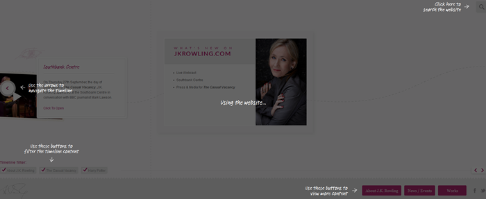
Now, maybe we’re just behind the ball when it comes to website design. Perhaps the trend these days is to make sites so confusing that you have to explain to visitors how to use the website. I’m not buying that. I think the advice that Steve Krug wrote in Don’t Make Me Think back in 2005 still applies in many ways today. However, the people in charge of Rowling’s website either don’t care about making a website’s navigation intuitive for the users or they realize that the last thing Rowling needs to worry about is making conversions that will lead to revenue flow, so they just throw all good advice out the window. Look at the details they go into to explain how to use the sight:


Okay…that’s why the website grayed out on me. I have to read the instructional manual first.


Thank goodness there’s a search function. I’m going to search “Why is this website so confusing?”


Should I be insulted that you don’t think I know how to click on an arrow to navigate?


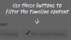
I might have been able to pick that up from the Timeline Filter text that appears above the buttons, but who knows?


Ahhh…the main navigation is buried at the bottom of the page. That makes perfect sense!

Overall, I would label this website a disaster. As a user, I fluctuated between frustrated at the site’s design (such as the navigation only being on the bottom) to be slightly insulted (do you really have to explain to me that I should click on an arrow?). An effective website shouldn’t confuse, frustrate, or insult users; it should tell them what to do. Technically, the Rowling website does just that, but clear calls to action should guide users through the website – not instructions. True, Rowling doesn’t need to worry about her website raking in more money for her. It’s probably not affecting her too negatively. But for most people and most websites, such a design would be a kiss of death.

Read More